A reassuring presence instilling calm, confidence and connection.
ANNOUNCING THE PANTONE
COLOR OF THE YEAR 2020
Classic Blue
PANTONE 19-4052
ABOUT PANTONE 19-4052
Classic Blue
A timeless and enduring blue hue elegant in its simplicity. Suggestive of the sky at dusk, the reassuring qualities of the thought provoking PANTONE 19-4052 Classic Blue highlights our desire for a dependable and stable foundation from which to build as we cross the threshold into a new era.
Imprinted in our psyches as a restful color, PANTONE 19-4052 Classic Blue brings a sense of peace and tranquility to the human spirit, offering refuge. Aiding concentration and bringing laser-like clarity, PANTONE 19-4052 Classic Blue re-centers our thoughts. A reflective blue tone, Classic Blue fosters resilience.
As technology continues to race ahead of the human ability to process it all, it is easy to understand why we gravitate to colors that are honest and offer the promise of protection. Non-aggressive and easily relatable, the trusted PANTONE 19-4052 Classic Blue lends itself to relaxed interaction. Associated with the return of another day, this universal favorite is comfortably embraced.
ABOUT
The Pantone Color Institute™
The Pantone Color Institute™ is the business unit within Pantone that highlights top seasonal runway colors, forecasts global color trends, and advises companies on color for product and brand visual identity. Through seasonal trend forecasts, color psychology, and color consulting, the Pantone Color Institute™ partners with global brands to leverage the power, psychology, and emotion of color in their design strategy.
ABOUT
Pantone Color of the Year
For 21 years, Pantone’s Color of the Year has influenced product development and purchasing decisions in multiple industries, including fashion, home furnishings, and industrial design, as well as product, packaging, and graphic design.
The Color of the Year selection process requires thoughtful consideration and trend analysis. To arrive at the selection each year, Pantone’s color experts at the Pantone Color Institute™ comb the world looking for new color influences. This can include the entertainment industry and films in production, traveling art collections and new artists, fashion, all areas of design, popular travel destinations, as well as new lifestyles, playstyles, and socio-economic conditions. Influences may also stem from new technologies, materials, textures, and effects that impact color, relevant social media platforms and even upcoming sporting events that capture worldwide attention.
"We are living in a time that requires trust and faith. It is this kind of constancy and confidence that is expressed by PANTONE 19-4052 Classic Blue, a solid and dependable blue hue we can always rely on... A boundless blue evocative of the vast and infinite evening sky, Classic Blue encourages us to look beyond the obvious to expand our thinking."
LEATRICE EISEMAN
EXECUTIVE DIRECTOR, PANTONE COLOR INSTITUTE™
2020 COLOR OF THE YEAR EXPERIENCE
TEALEAVES
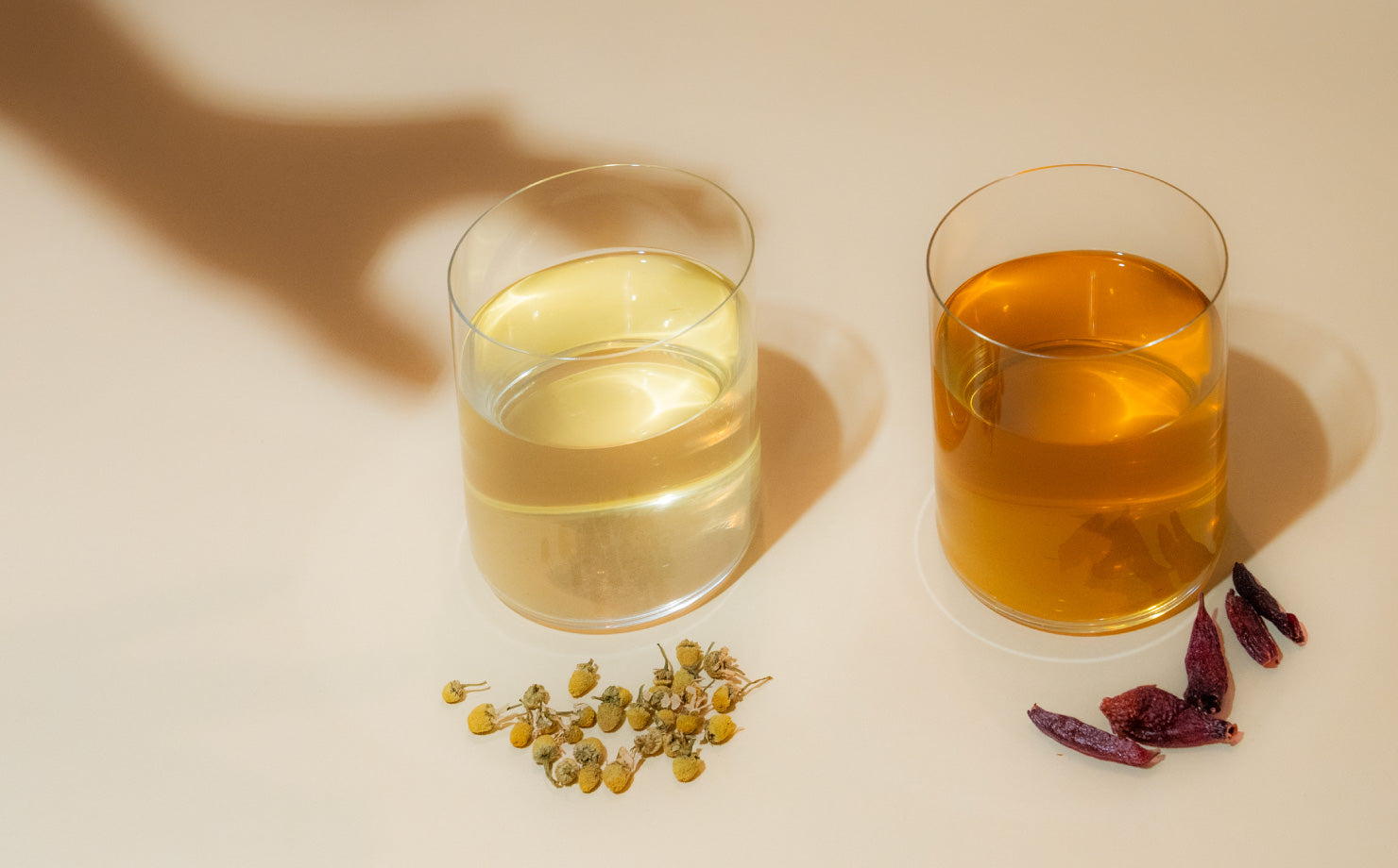
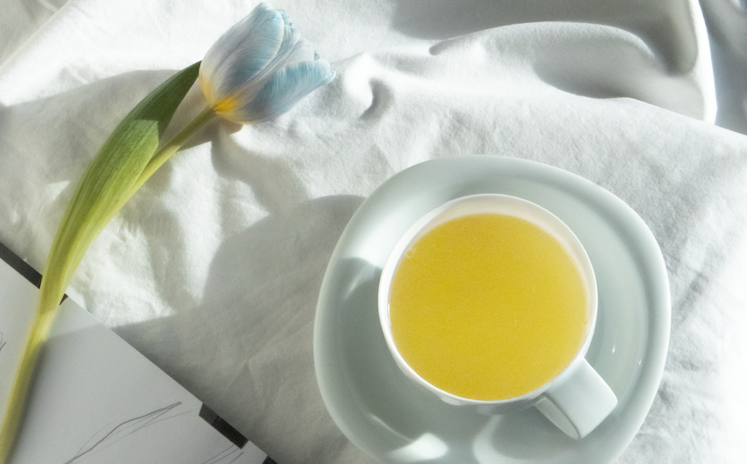
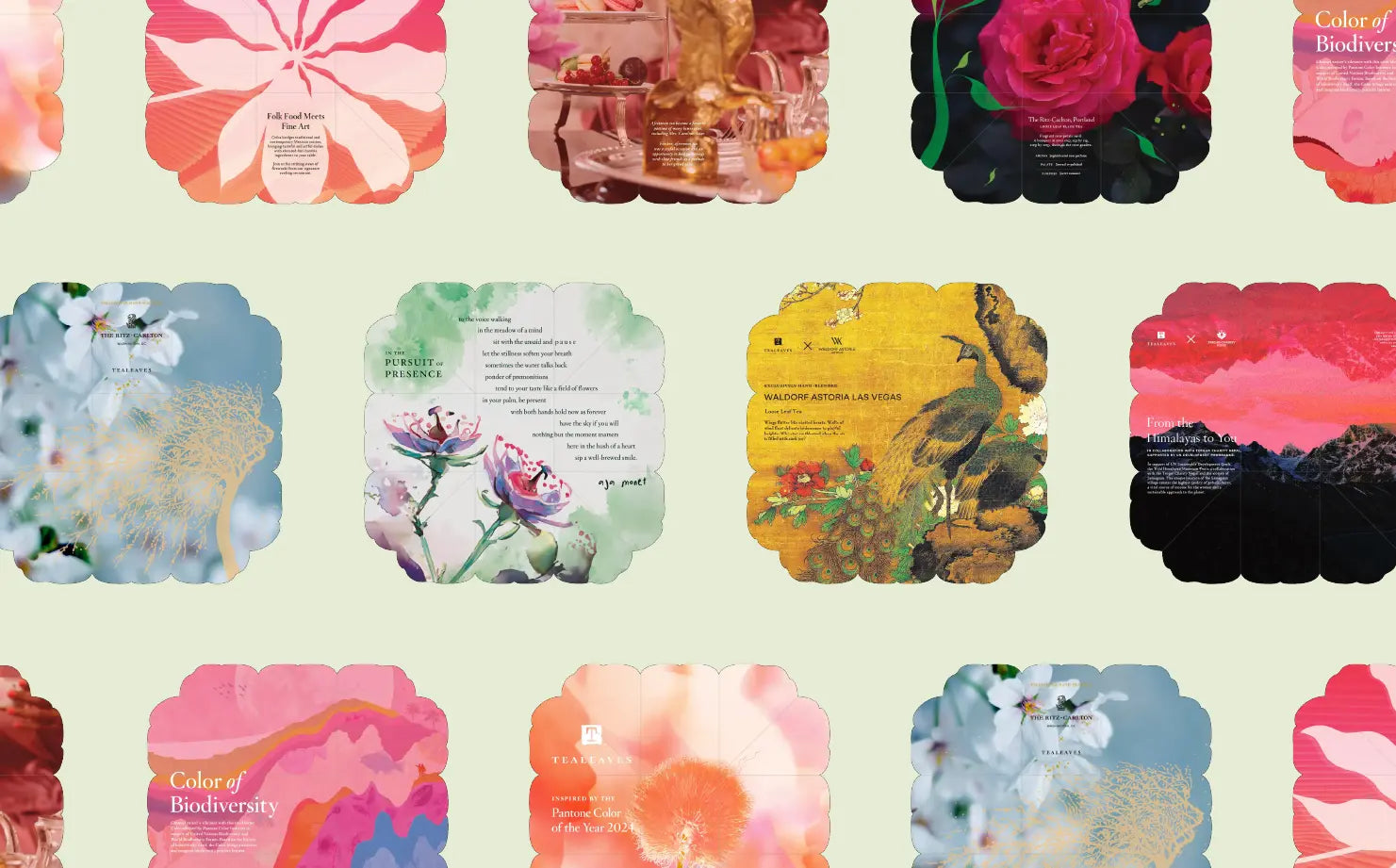
Partners with Pantone in curating colorful experiences since 2015, TEALEAVES, the luxury tea blender of choice for Michelin-star Chefs and 5-Star hotels worldwide, blended the official bespoke tea blend to harmonize the color, aroma, and taste of PANTONE 19-4052 Classic Blue.
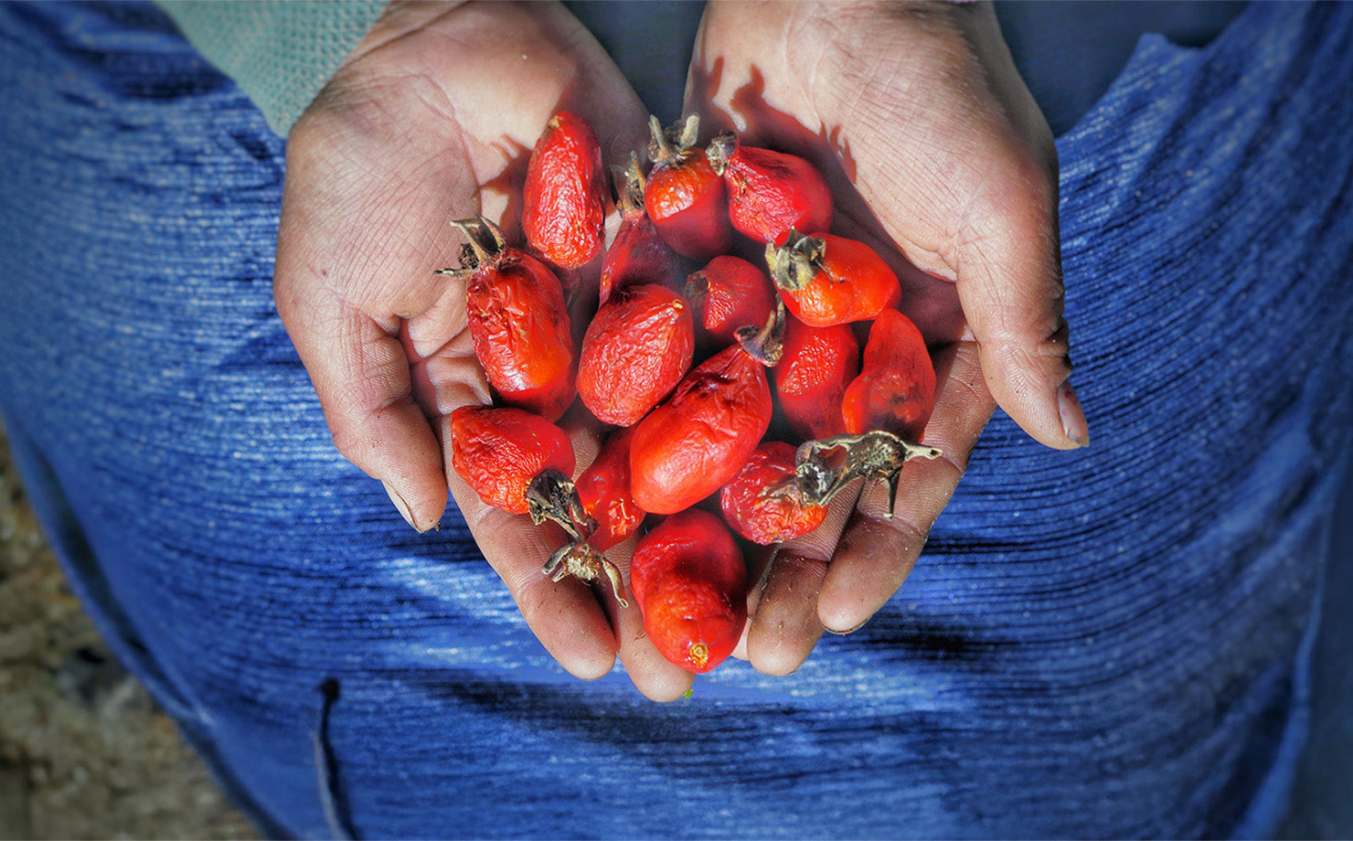
Inspired by the rich symbolism associated with the color, TEALEAVES’ Master Blenders have used the highest grade botanicals to create a wellness-oriented, elegant, and expansive berry mélange with subtle citrus notes. The Pantone Color of the Year 2020 tea blend is the epitome of a perfect palate expression of the color, created through the art of blending.
Audio UX
The sound of PANTONE 19-4052 Classic Blue is what we call “Vivid Nostalgia.” The sound builds on the timelessness and enduring nature of PANTONE 19-4052 Classic Blue, as our hearts call for a nostalgic song that takes us to a place of comfort and familiarity. Vivid Nostalgia utilizes traditional instruments treated in innovative ways, bridging the gap between past and present. Included in this sound pack are 146 different components that bring PANTONE 19-4052 Classic Blue to life, that aim to serve as inspiration for creatives across the world. This Color Sample Pack will be available for free download via music hosting platform, LANDR.
Firmenich
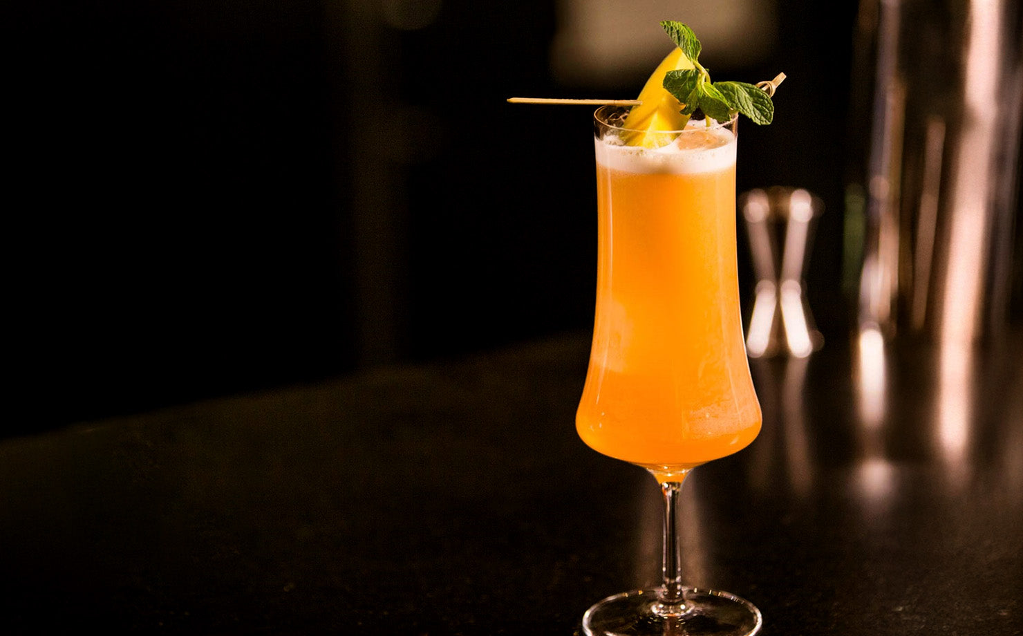
Together with Firmenich, Pantone will reveal both the "scent" and “taste” of the Color of the Year.
PANTONE 19-4052 Classic Blue is a fragrant contemplation of where sky and sea meet – a boundless blue where there is no end. The scent first opens with notes of blue water and sea salt lifted by airy sky. An accord of a fluffy cloud combines with waterlily and seaweed absolute bringing tranquility to the heart of this ode. Notes of blue musk, soothing minerals, and ocean timber give depth and calm for a reassuring finish. The smell of PANTONE 19-4052 Classic Blue is brought to life through a candle that will transform you into a state of contemplation and a feeling of optimism for the future.
In a few ephemeral moments, unripe berries shift from opaque green to pink and purple, then to a ripening blue with gentle yet profound elegance. It’s a wholesome motion-filled act of maturation called Veraison—a dance of ripening that intoxicates the senses. This is the essence of the taste of PANTONE 19-4052 Classic Blue.
The Inside
The touch of PANTONE 19-4052 Classic Blue is anchored within the transitional quality of the color - specifically how that manifests in the sky at dusk. This idea of transition, and the duality of security and possibility and how it can empower you to expand your mind and build the foundation for the future is the essence of touch for PANTONE 19-4052 Classic Blue. It translates into a soft, velvety texture to print on, further emphasizing the comforting quality of this year’s Color of the Year.
The custom fabric will be available for a limited time to purchase on a select number of The Inside’s furnishings and decor. Due to the intentional interpretation of the pattern, color may vary slightly.
Artechouse
A permanent new age destination for art and technology, ARTECHOUSE creates one-of-a-kind, immersive art experiences. This innovative art space dedicated to showcasing and producing experiential and technology driven works of art will serve as the backdrop of our official Color of the Year announcement to media and influencers across several design and creative industries. Inspired by the tranquility and calming effects of PANTONE 19-4052 Classic Blue, Pantone collaborated with the destination and their team of creatives to produce a unique, fully immersive multi-sensory experience.


